

GoGrid needed to 're-brand' so that their Products, Services and strategic Partnerships (for example; Big Data alliances) would be instantly recognizable, trusted and respected. They wanted to stand out from the crowd. I led the effort to simplify and modernize the brand through augmentation of the color palette and a redesign of all their iconography and 'graphic-symbology' as employed across their websites, portals, blogs, wiki, micro-sites and partner sites. Doing so, involved collaborating with Product Management, Marketing, Engineering.
- Objectives
- The Team
- Preliminary Idea
- Requirements
- Constraints
- Process
- 1-Button Deploy
- Would I have done anything differently?
Objectives
Create a series of graphical symbols to unify, consolidate and above all represent all GoGrid's Products and Services.
The Team
Like most worthwhile projects of magnitude and importance we assembled a small team to tackle the re-branding efforts:
- Myself: Lead Designer and visionary
- Director of Content: Stakeholder and adviser
- Marketing Manager: Communications coordinator
- contract Graphic Designer: Pixel perfection
- Director of Product Management: Stakeholder and adviser
Preliminary Idea
It was clear we needed a unique GoGrid visual identity. An emblem which told the world; 'This is a GoGrid product/service/partnership'. As soon as the metaphor of a badge planted itself in my mind, things solidified rapidly. I began to ponder why people like badges - afterall, they can say many things. From 500feet, they usually infer that the person wearing one :
- Believes enthusiastically in something
- Identifies with, respects and supports something
- Trusts what the emblem stands for
Further, badges invariably have their own
- color
- shape
- symbols, ...maybe many
- type/flavor/version, ...maybe many
Requirements
So, the "badge" idea took form in my mind. It must be ŌĆ£at a glance intuitiveŌĆØ to GoGrid techy-customer personas and especially to those favoring 'Self-Service' in the cloud so; engineers, developers and ops personnel
Design Constraints
- No 3D, gradients or shadow - it's too dated for this time period ('13/'14)
- Use simple, flat, symbolic iconography utilizing color palette
- Lead 'symbology' with GoGrid Power symbol
- Use specific size based on environment (website Marketing event, Portal)
- Use symbols, consistently across website, blog, micro-sites, portal and on trade show stands, cards and discount tokens
Process
- Before we get started, study the competitor branding to ensure our brand stands apart and does not accidentally plagiarize in any way(Firehost, Softlayer, Joyent, AWS, Rackspace, Azure,..etc)
- Ensure there is nothing in the potential designs which might alienate, offend, repel the GoGrid personas
- Place everything on a white background to help it 'pop'
- Develop persona's which the design need to speak to (See: 'Personas' in Corp Web Design project)
- Use nouns or adjectives to describe GoGrid's products and services
- Use iconography to infer the above adjectives
- Give the badge a specific and easily identifiable shape
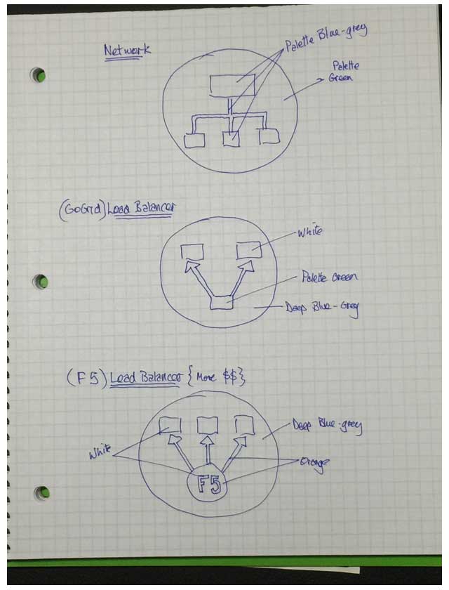
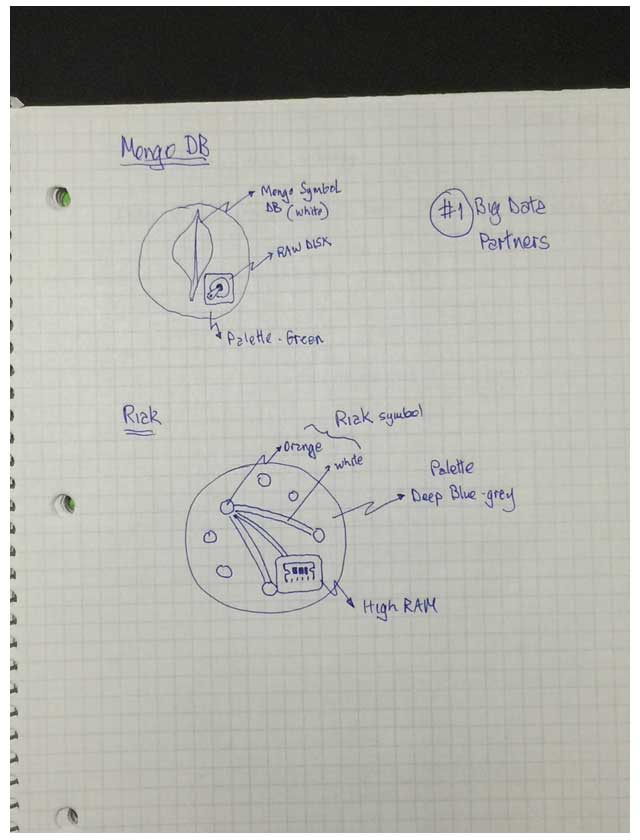
- Employ color from palette to represent each parent category of product or service (Compute, Storage, Network, Managed Service)
- Use 'symbology' to denote each parent category
- How might a partnership be represented without diluting the GoGrid brand? They need to feature together but not compete
- Combine the above into a series of uniquely synonymous yet consistent badges
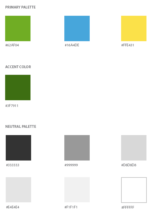
So, I started with the palette. The Marketing and Products groups wanted it to be livelier, more eye catching and we all agreed that we should dispense with the gradient effects and stock photography which a previous design consultancy had introduced to the GoGrid brand (websites, printed collateral, booths,ŌĆ”etc.). They had their moment - but it had passed.
Old Stock Photography Hero graphics

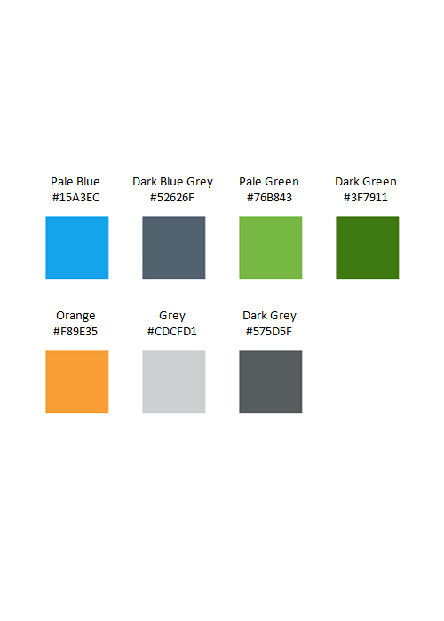
Notably, owing to all the ongoing marketing efforts, I wasnŌĆÖt to throw away the palette, just, make it richer and perhaps 'retire' some colors. In other words, the new palette borrowed from its predecessor, updated and augmented it :-?
GoGrid used iconography for its self-service portal. This meant each icon it utilized had to be replaced and had to be as intuitive or more so. Some of the current 3D icons were ambiguous and I felt could have been part of any clip art collection. For the mostpart, they did not say GoGrid:
GoGrid's Old Gradient based 3D Iconography
![]()
I wanted our Products and Services to be easily distinguishable and above all synonymous with GoGrid. So, I knew they should exhibit more than flat design. They should all:-
- look uniquely ŌĆśGoGrid-ishŌĆÖ,
- be simple - to mitigate ambiguity
- be easily understood by the target audience(s)
- conform to the color palette
- sit upon a common shape
I started sketching simple ideas on paper. We hired a talented Graphic Designer and worked with her directly (whiteboard sketches) and subsequently sent her photographed sketches which we would discuss over the phone or face to face.
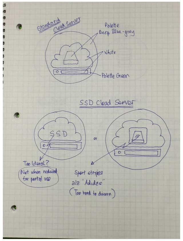
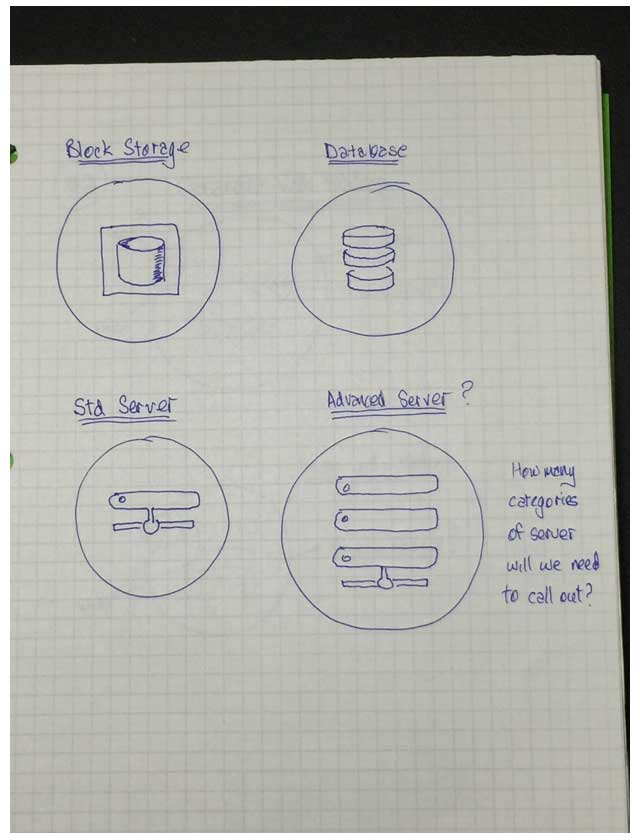

Refining these a bit for presentation to internal stakeholders :-
Things started to fall into shape and soon I had amassed a sprite full of icons in an enabled and disabled state for our websites and portal. Gradually we extended this branding aesthetic to more and more Big Data partnerships which GoGrid established :-
Click to enlarge
GoGrid's Products and Services in a Sprite
![]()
As can be seen above, our partners technology could be offered easily within our Portal by following the same design aesthetic: The only caveat was that their logo had to sit on our brand color. A bit 'cheeky' perhaps but I managed to convince everyone including Partners of this necessity - it all came together nicely. If weŌĆÖd used their brand colors in our Portal, it would have diluted our brand or worse still competed with it in a bad way. That might have been a little visually crazy, because GoGrid offered numerous products, services and partnerships. The new graphics received a lot of compliments for ease of use, consistency, intuitiveness and clarity from executives, GoGridŌĆÖs partners and DatapipeŌĆÖs CTO (GoGrid was purchased by Datapipe in Jan 2015).
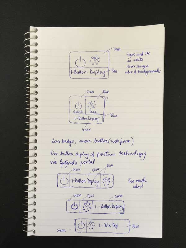
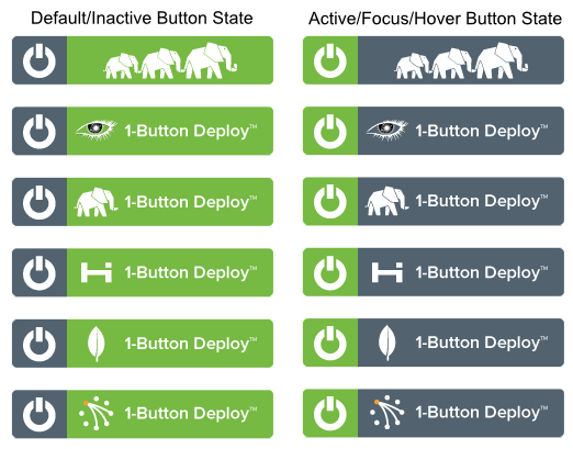
1-Button Deploy (the Big Data Alliances)
Around this time we were pushing a 1-Button Deploy campaign. Basically, this meant enabling the setup and initialization of Big Data Partner technology upon GoGrid's cloud infrastructure. It was pretty slick. The unique value proposition was that the software seamlessly took care of everything with the click of a button - thereby making life very easy for Dev. Ops engineers and software developers. All you had to do was register for a GoGrid account. So, again we needed a compelling Call to Action button that unified our cloud platform with the partners technology and this button would be used on webforms to direct potential customers to our Secure Signup.
Consistency Across the Brand
Finally, in addition to the Drupal based Corporate website, I was also in charge of a Drupal based Partner Portal, A WordPress Blog and a MediaWiki Wiki. All of these customer facing assets needed to be distinctly 'GoGrid-ish' and in particular, had to exhibit brand consistency.
In the web-world this is pretty simple and was accomplished by employing similar headers and footers across these sites.
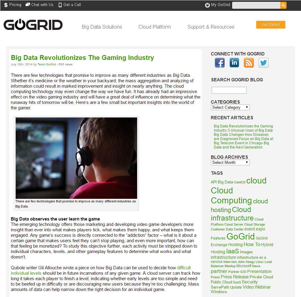
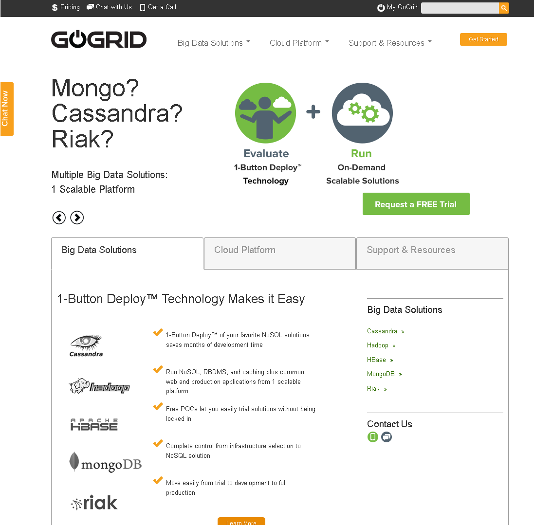
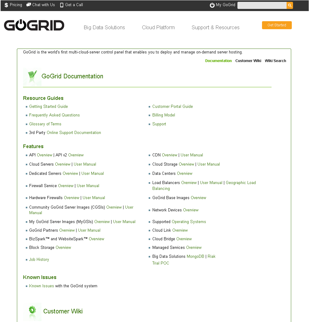
Some examples of that implementation follow:
Would I have done anything differently?
Looking back, if I had to do that project over again, I donŌĆÖt think IŌĆÖd change much. I could have used more help so, a contractor with some intermediate web design skills would have helped. At the time, I had many parallel projects going on simultaneously (Blog, Wiki, Website redesign and micro-site launches). The re-branding project seemed to co-ordinate these other design challenges. It became a point of confluence. Overall, it was pretty successful in relaunching the GoGrid brand in a busy marketplace and enabled us to stand out in a good way.