I was hired to design, develop, manage and maintain GoGridŌĆÖs websites. Gradually this role was augmented to include some design for their customer facing applications(registration and portal). The following sections summarize the work undertaken on the corporate web site and in particular its lead generation functions:
The Break-Fix Problem
I inherited a broken Drupal 7 based website. Three people had worked on it (2 employees and one contractor) prior to my arrival. One was laid off, oneŌĆÖs contract finished and one was busy working on other software development projects so, it was left in a bit of a shambles.
As their primary customer facing communication medium, GoGridŌĆÖs management wanted it fixed ASAP. So, leveraging years of HTML, CSS, JavaScript, SalesForce and Drupal experience, I addressed all the issues. The only limitations were time. I had to make changes to the code base whilst adding new content for the Marketing, Products and Sales teams in weekly sprints and simultaneously designing a new site (see Next Problem below). Looking back, it was hectic ŌĆō but I fixed it and thatŌĆÖs what counted on a number of levels.
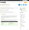
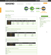
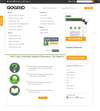
Metrics for success ŌĆō it was a mess and after 'the mending' it looked and functioned as expected while also successfully propagating leads from the contact form for the Marketing and Sales teams. I've only shown a couple of the pages that were broken to convey the fix but the issues were evident throughout the site.
Site Redesign
GoGrid leadership wanted to create a less stock photography and gradient dependent site. Besides their desire to ŌĆśmake it look coolŌĆÖ my usual process kicked off with a little Q&A:
- How does the sitemap look today and how do we need it to change for tomorrow?
- A catalog site today, a bigger catalog tomorrow augmented to include Big Data offerings and Managed Services
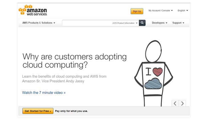
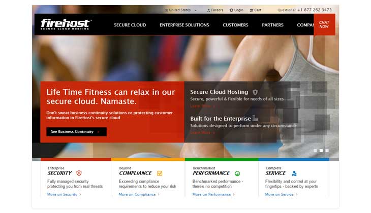
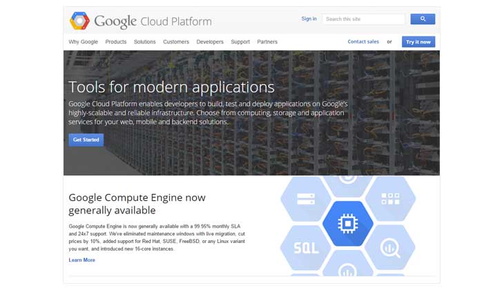
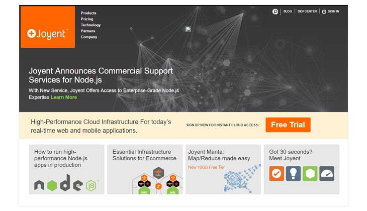
- Who are our competitors, what are they doing both well and poorly?
- Rackspace, Amazon, Firehost, SoftlayerŌĆ”etc
- Who are our audiences today and who do we need them to be tomorrow?
- Persona research and development
Before we get into it, I should mention that like most projects, there was a team involved. It took the following form:
-
The team:
- Director of Content: The wordsmith for all content
- Director of Product Management: The go to Market Strategy
- Marketing Manager: Communicated shifting sands to Graphic Designer
- Marketing Manager/Analyst: The Marketing and Sales Lead Strategist
- Me: The concept to align with strategy, the problem solver, the design per customer persona
- The consultant Graphic Designer: The pixel perfection
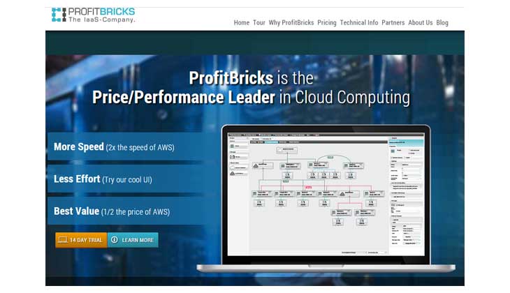
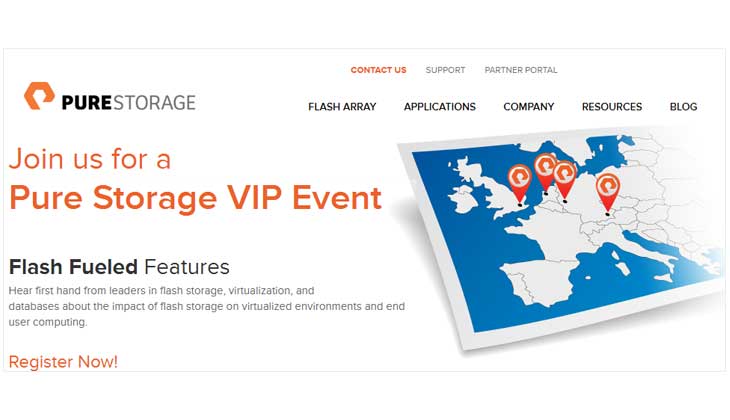
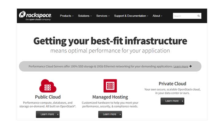
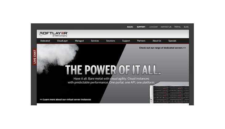
Work started by analyzing our competitors sites.
I noted what they did well and poorly. In so doing, this analysis led me one step closer to what we could do better and how we might stand apart. I started this work with a small comparison matrix:

Click to enlarge
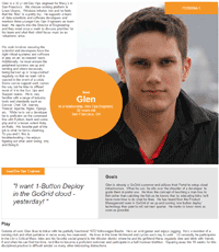
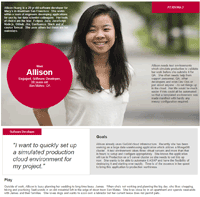
GoGrid had four persona types from a 2011 Product Management Group survey which broke the audience into Execs, Users, Buyers and Entrepreneurs. By the time I started working, they had thrown most of that out the window and were focusing on Software Developers, Dev Ops engineers and heads of engineering groups to a lesser extent.
With the help of Product Management, I was able to empathize with the two most prominent members of our customer base and convey who they were to the team via Persona Summaries:
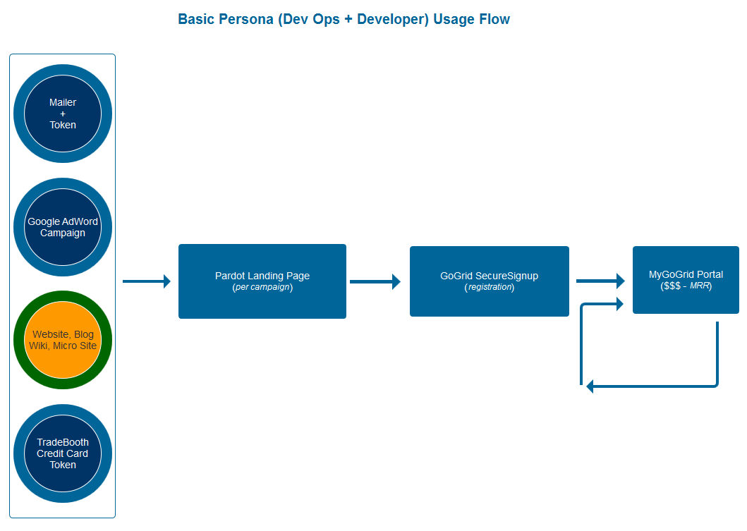
Cold calling was mostly abandoned in favor of online marketing and Sales campaigns. This meant GoGrid's pursuit of the all important monthly recurring revenue (MRR) stemmed from one of four origins:
- Google AdWord Campaigns
- CTA's upon the Website, Blog, Wiki or Micro Sites
- Discount Tokens handed out at Trade shows
- Mailer campaigns which included discount tokens
User actions (launching virtual machines, adding block storage,...etc) inside the MyGoGrid portal were the ultimate goal for GoGrid. Portal usage was billed for on a monthly basis and outside of paying for support, getting customers inside the portal and having them use GoGrid cloud infrastructure was what paid the bills.
Next came the sitemap decision making. How might we compartmentalize the web site to encompass all our products and services while calling out GoGrid's "high touch" support. The latter was one of GoGrid's unique value propositions within the cloud hosting market as few if any of our competitors offered as much customer hand holding.
The site map would undergo many changes as would the website itself in order to accommodate our changing strategies and marketing campaigns.
The sitemaps which we manifested into reality :
Next weŌĆÖd discuss the findings and develop some whiteboard sketches and present them as more formalized/higher fidelity wireframes to management
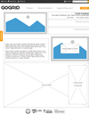
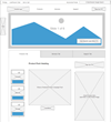
A lot of 'wireframing' happened and as you'd expect, not much of it got realized. Here are some preliminary wireframes dating back to when a gradient style was still being considered and some more modern ones:
Through gradual iteration we honed in upon the site we wanted. Below, are some examples of those wireframes and pages which resulted from them
In parallel with the research and design process above, we needed to consider a corporate color palette which could be mapped across all GoGridŌĆÖs media (print, booths, web and apps). A big part of the GoGrid site redesign involved how we branded our products and services but you can learn about that under Brand Redesign.
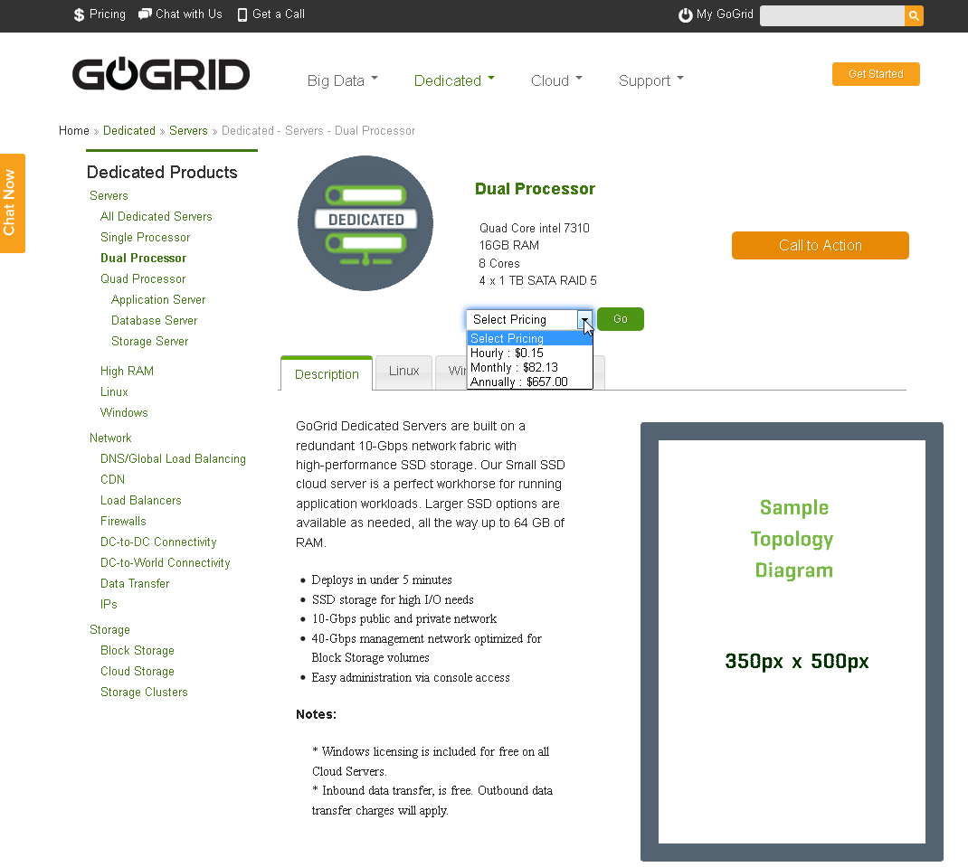
Notably, wireframes proved useful when conveying ideas to engineers, product managers and middle management but they are met with disdain by more senior managers and leadership who can't seem to grasp their meaning unless a prototype with lots of visual imagery and color is utilized. This meant abandoning wireframes in favor of what I term 'ProtoFrames' for presentations to leadership. A PrototFrame is basically a Prototype with some wireframed blocks/panels in it. At one point our CEO wanted an eCommerce user experience to start upon a Product Page on the website. To convey how it might appear, I used a ProtoFrame:
Designing a Unique Value Proposition(UVP)
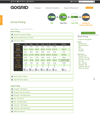
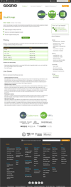
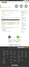
Amazon was dominating the cloud infrastructure space. Everyone knew about them, was using them or moving in that direction. We 'glommed' onto any and every competitive advantage we could muster by way of unique value proposition in our David-quest to stand out against that Goliath. GoGridŌĆÖs CEO was determined to have a full pricing page which was easy to digest. At the time AmazonŌĆÖs pricing was so confusing it seemed impossible to clearly reconcile how much you might pay for one or more of their AWS offerings. It was maddening to the customer. Doubtless that was on purpose but we wanted to stand out and were determined to do better by the customer. I was asked to consolidate all our Server and Network Products on two pages in a clear and intuitive design - make them one of our unique value propositions. That challenge resulted in the GoGrid Pricing pages:
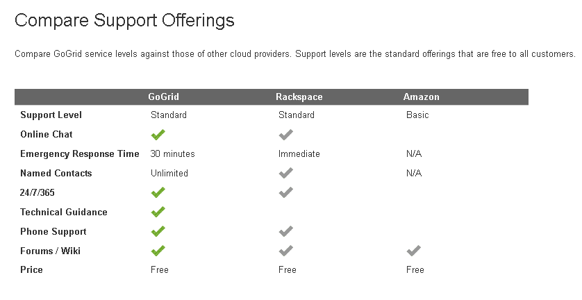
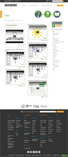
Another example of GoGrid's Unique Value Propositions (UVP) was the high touch support. Support had its own site section for this reason:
Requirements & Limitations:
- catalyze sales and lead generation,
- incite registration and inform.
- exhibit the full GoGrid catalog
- track which campaigns worked and which did not
It must sport webforms which generate leads. It should exhibit chat interactivity which can capture leads if no Sales personnel are available.
The requirements above meant integrating Drupal with
- Pardot
- LivePerson
- SalesForce
- The GoGrid Django based Registration and Portal Applications
So my role involved:
- Development of and ensuring that:
- pre-qualification leads got into Pardot
- leads got into SalesForce
- leads were generated from LivePerson Chat
- campaigns were tracked for reconciliation
- propagation of ŌĆśCalls to ActionŌĆÖ(CTAŌĆÖs) from the site to:
- Pardot landing pages,
- the GoGrid SecureSignup form and
- the GoGrid Self Service Portal
- simplifying and displaying all GoGrid pricing on one page
- incorporating the new brand identity into the site,
Customers landed upon marketing pages on our Drupal based website with CTAŌĆÖs which drove them to Pardot landing pages. Between these pages, customer ŌĆśchatsŌĆÖ, our websiteŌĆÖs webforms and our SecureSignup registration pages we would create leads in Salesforce or pre-qual leads in Pardot.
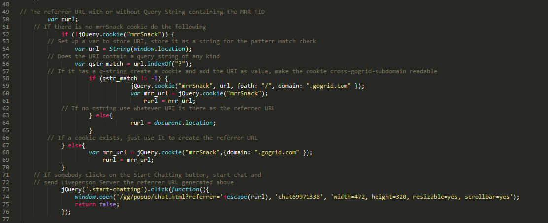
GoGrid was spending a lot of money on campaigns. $85k/month on Google ads alone. Remember it was a small company so, that was a lot of money at the time. They needed to know the ROI on them but couldnŌĆÖt track that across all its sites and sub-domains. They wanted a means of tracking which campaigns were bringing people to our websites especially when the visitor wanted to ŌĆśchatŌĆÖ. To make sense of which ad campaigns were driving monthly recurring revenue (MRR) I tweaked the jQuery based Chat window across the sub-domains to capture which campaign had brought the visitor this far
With this information identified, the campaign could be written into Pardot and Salesforce for lead generation and analytics when somebody registered.
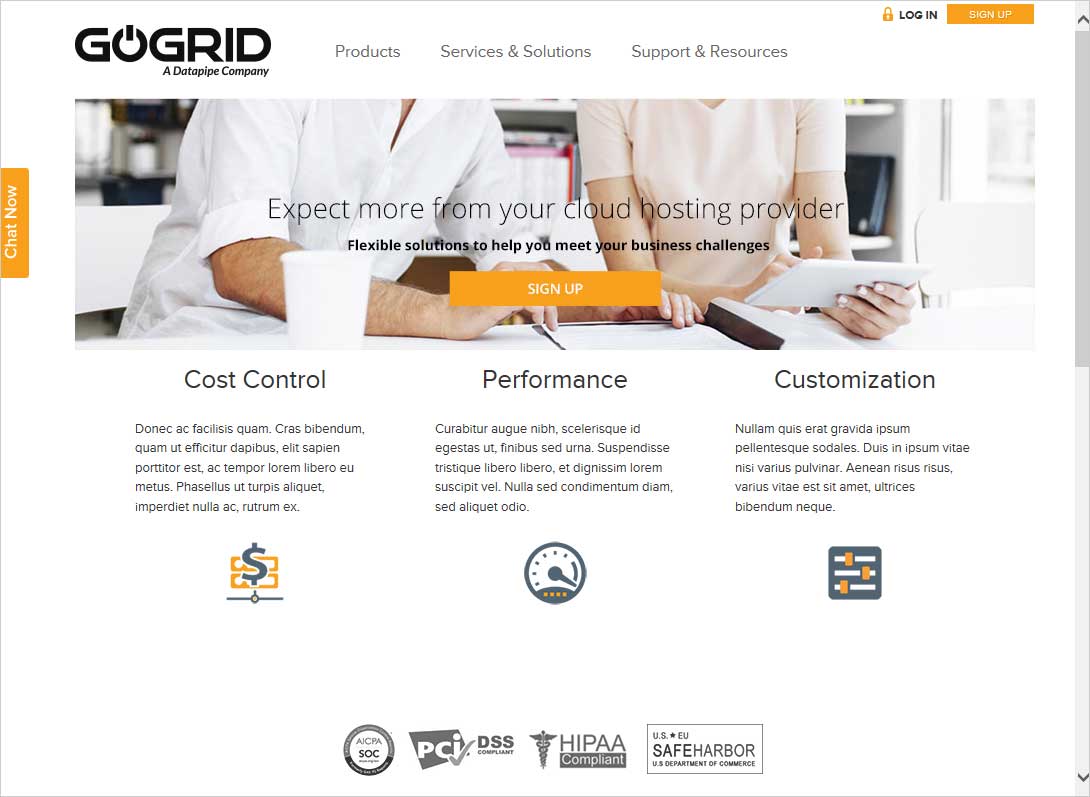
The redesign was coincident with GoGrid's entrance into the world of 'Big Data'. It was such a huge release for the company that the whole project was termed the 'Big Bang'. Project labels aside, we ended up with a site that looked a lot like:
Subsequent variations were released to coincide with major GoGrid Product releases and in particular, how management decided to position the company, it changed frequently as Amazon and Rackspace won more and more market share.
If I had to do it again, what if anything would I do differently?
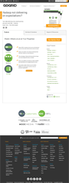
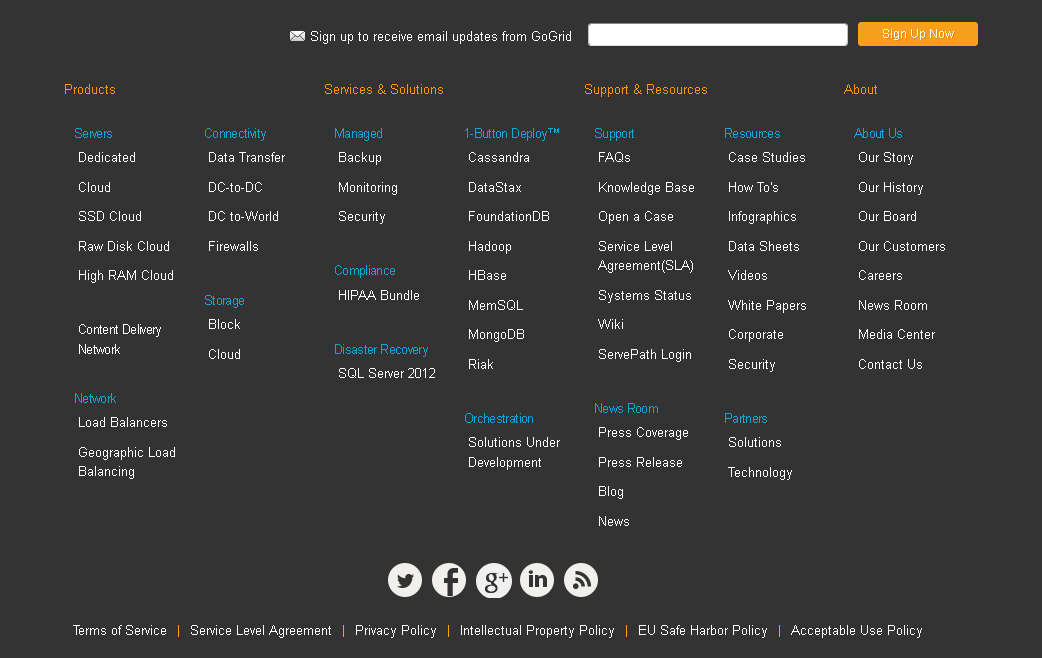
Well, it wasnŌĆÖt a fully responsive site. At that time (2013/2014), it should have been but GoGrid was primarily interested in maintaining what they had (a 960px grid based 12 column layout), augmenting and rebranding it. They wanted a vast catalog site offering multi cloud solutions for everything . To understand what that meant, check out the various sitemap incarnations above or even just the footer of the website:
I began making the website responsive via Bootstrap. However, soon into this work, GoGrid was purchased by Datapipe and the site was retired.


